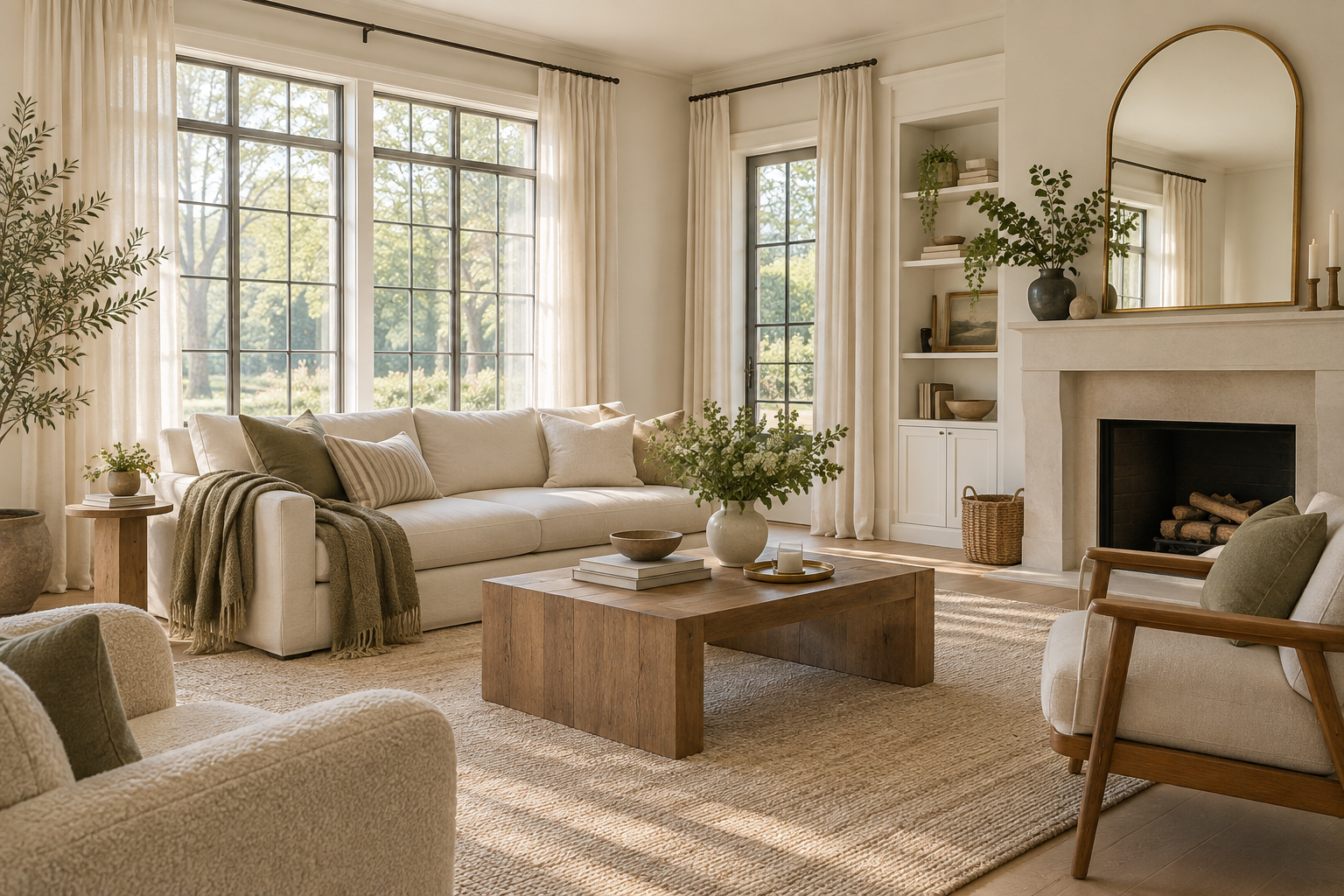
How to make a dark room feel brighter — and why white paint isn’t always the answer.
A dark room can make you want to immediately reach for more lamps, brighter bulbs, or a can of white paint.
Sometimes that helps.
Sometimes it makes almost no difference.
Because a room does not only feel dark because it lacks light. It can also feel darker because of the way that light is being blocked, absorbed, reflected, or even emphasized by the colors and furniture around it.
That is why simply painting everything white is not always the magic fix people expect.
A cool white in a low-light room can sometimes look flat, gray, or even slightly blue. Heavy curtains can quietly block more daylight than you realize. A large dark piece of furniture can visually weigh down an otherwise bright space.
Before adding more lighting, it is worth looking at how the room is actually using the light it already has.
From wall color and curtain placement to mirrors, furniture scale, and reflective surfaces, a few small changes can make a room feel noticeably brighter — without turning it into a showroom full of lamps.
1. Start With the Windows
Before changing the paint, furniture, or lighting, look at the obvious source first.
How much of the actual window is exposed?
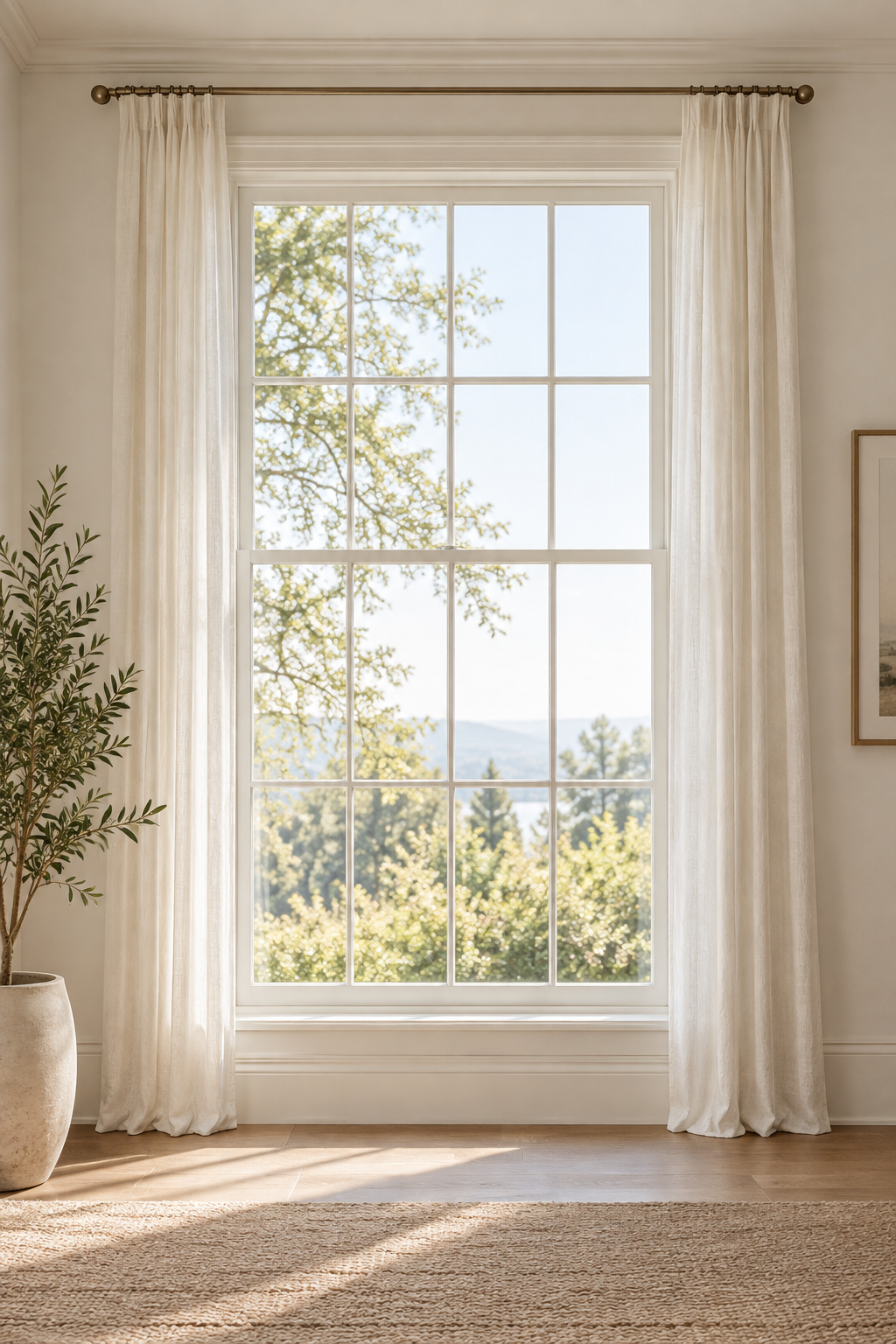
Curtains often block more daylight than we realize, especially when panels are mounted directly over the glass instead of extending beyond the frame.
Try this first
Open the curtains completely and look at where the fabric sits.
If possible, mount the curtain rod wider than the window so the panels can rest mostly against the wall when they are open.
You want to uncover as much glass as possible.
Even gaining a few extra inches of exposed window can make a noticeable difference.
And if there is furniture sitting directly in front of the window, consider whether it could move.
Natural light cannot help much if it is immediately hitting the back of a tall chair.
2. Do Not Assume White Paint Is the Brightest Choice
This is probably one of the most common pieces of advice for dark rooms:
Just paint it white.
But white paint does not create light.
It reflects the light that already exists.
In a room with very little natural light, especially one with cooler exposure, a crisp white can sometimes appear dull, gray, blue, or almost shadowy.
Try this instead
Look at softer whites, warm off-whites, pale greige, cream, very light taupe, or muted colors with enough warmth to work with the room.
The goal is not always to choose the palest possible color.
It is to choose a color that looks good in the light the room actually receives.
Always test paint directly in the space and look at it at different times of day.
A sample that looks perfect at noon may feel completely different by late afternoon.
3. Pay Attention to LRV
If you have ever looked at paint specifications and seen the letters LRV, this is where they become useful.
LRV stands for Light Reflectance Value.
In simple terms, it tells you roughly how much light a color reflects.
Higher-LRV colors reflect more light.
Lower-LRV colors absorb more.
But do not choose by number alone
A high LRV can help a room feel brighter, but undertone still matters.
Two paints with similar reflectance values can behave very differently depending on whether they lean warm, cool, yellow, pink, green, or gray.
Use LRV as one clue — not the entire decision.
4. Understand the Light Your Room Actually Gets
Not all natural light is the same.
A room that gets bright morning sun behaves differently from one that receives soft indirect light all day.
That is why a paint color can look beautiful in someone else’s home and completely wrong in yours.
Watch the room for a full day
Notice:
- when the room is brightest
- whether the light feels warm or cool
- which walls receive direct light
- which corners stay shadowed
- how the room changes in the morning and evening
You do not need to become an expert in window orientation.
Simply understanding how your room behaves before choosing colors can prevent a lot of frustration.
5. Use Mirrors Strategically
“Add a mirror” is another classic dark-room recommendation.
But where you put it matters.
A mirror in a dark corner reflecting another dark wall will not suddenly flood the room with daylight.
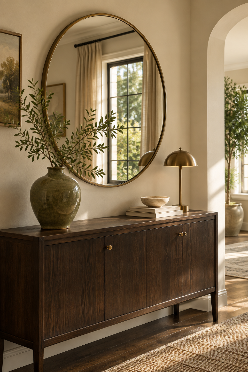
Place it where it has something useful to reflect
Try positioning a mirror where it can catch:
- a window
- a bright wall
- an open doorway
- a lamp
- a lighter area of the room
Think of a mirror as a tool for redirecting light and visual space rather than simply another decorative object.
A well-placed mirror can make the room feel more open.
A randomly placed one may just reflect the part of the room you were already trying not to look at.
6. Reduce Visual Weight Around the Window
Sometimes a room technically gets decent light but still feels heavy.
Large furniture, thick curtains, dark shelving, and bulky objects around the window can visually close in the space.
Look at the area around your brightest wall
Could a tall piece move somewhere else?
Would lighter curtains help?
Could a crowded windowsill be simplified?
Could a dark cabinet beside the window move to another wall?
You do not need everything in the room to be light-colored.
But keeping the area around your natural light source relatively open allows the room to breathe.
7. Use Contrast Instead of Making Everything Pale
It sounds counterintuitive, but a completely pale room can sometimes feel flat rather than bright.
A little contrast can help the lighter areas feel more intentional.
Try controlled depth
A darker wood table.
A charcoal frame.
An olive chair.
A deep brown lamp.
A few stronger elements give the eye reference points, which can make lighter walls and textiles feel brighter by comparison.
The goal is not to make the room dark.
It is to avoid washing everything into one pale tone.
Brightness and contrast can work together.
8. Look at Your Finishes
Different surfaces interact with light differently.
Matte finishes tend to absorb and soften light.
Satin, glass, metal, glazed ceramic, and polished stone reflect more of it.
That does not mean every surface should be shiny.
Please do not turn the room into a reflective box.
Aim for a mix
Use soft matte surfaces for warmth and a few subtly reflective materials to bounce light around.
Think:
- clear glass
- glazed ceramics
- metal accents
- mirrors
- polished stone
- satin paint in certain applications
- lightly reflective picture frames
A room often feels brighter when light has a few places to travel.
9. Check the Scale and Color of Large Furniture
A single large piece can change the visual weight of an entire room.
A huge dark sectional in a small, low-light room may be perfectly comfortable, but it can also absorb a lot of visual space.
That does not automatically mean you need to replace it.
Work with what you have first
Try adding a lighter throw.
Move the furniture slightly away from the darkest wall.
Simplify what is around it.
Use a lighter rug underneath to create separation.
Add lighter pillows or nearby textiles.
Sometimes creating contrast around a dark piece is enough to stop it from dominating the room.
10. Then Look at the Artificial Lighting
After you have improved how the room handles natural light, artificial lighting becomes much more effective.
This does not mean filling every corner with a lamp.
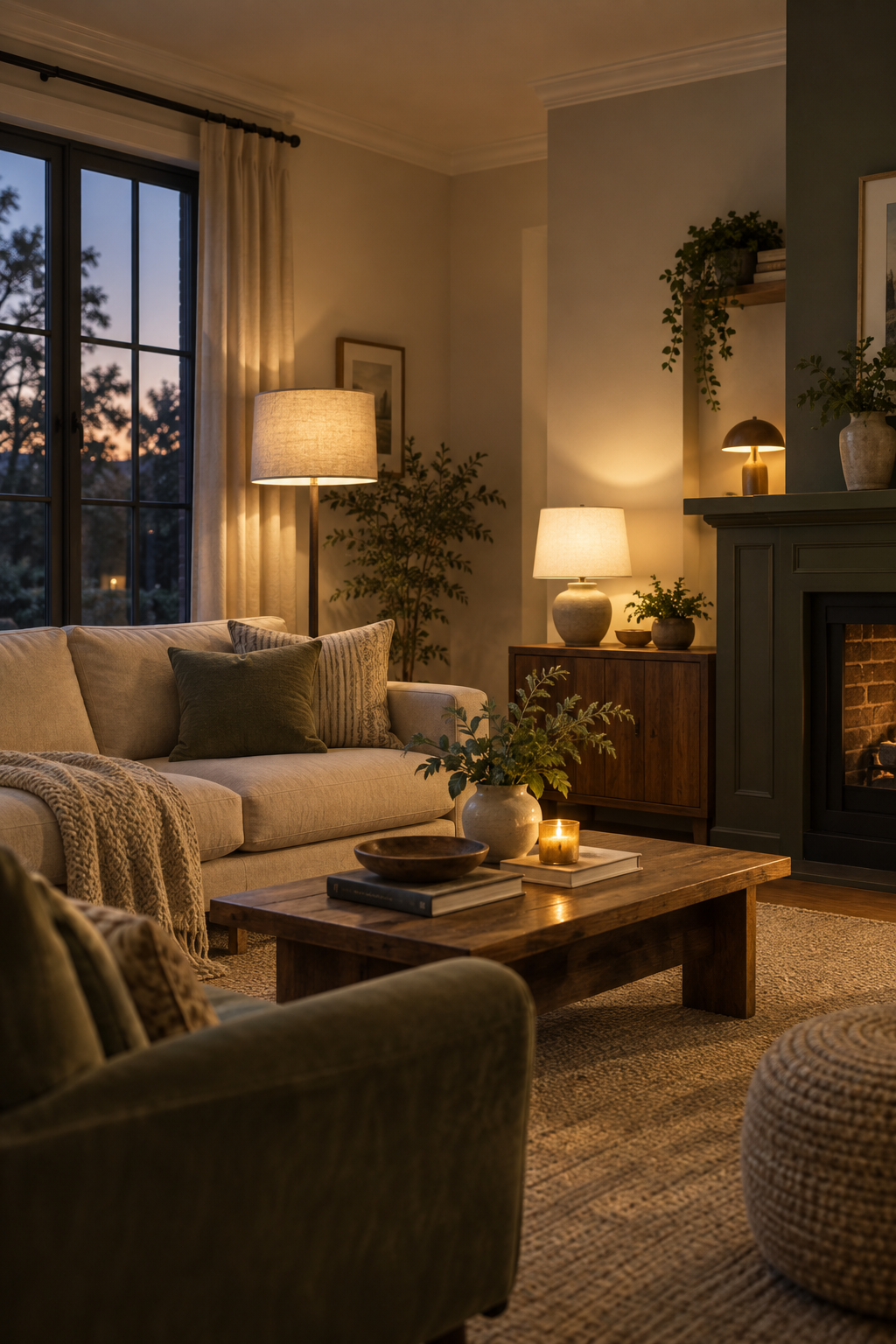
It means using light in layers.
Instead of one bright ceiling light, think about
- one table lamp
- one floor lamp
- task lighting where needed
- a small accent lamp
- warm, comfortable bulb temperatures
The goal is to light different parts of the room rather than blasting everything evenly from above.
At night, several lower sources of light usually create more depth and warmth than one extremely bright fixture.
Why Painting a Dark Room White Can Sometimes Make It Worse
It is worth coming back to this because it sounds so simple:
White reflects light.
So white should make every room brighter.
But color perception depends heavily on the light available.
In a bright room, a crisp white can look clean and luminous.
In a dim room, that same white may not have enough light to reflect, so the shadows become more obvious and the paint can appear dull or gray.
This is why slightly warmer or more pigmented colors can sometimes feel better in darker spaces.
They are not necessarily reflecting more light.
They are simply interacting with the existing light in a way that feels softer and more intentional.
That is also why paint samples matter so much.
Never choose a wall color based only on a small swatch under store lighting.
A Quick Bright-Room Check Before You Buy Anything
Before adding another lamp, mirror, or can of paint, ask:
Is anything physically blocking the daylight?
Curtains, furniture, plants, or clutter may be reducing the light you already have.
Does the wall color work with the room’s actual light?
Not the Pinterest photo.
Not the paint store.
Your room.
Is the space visually heavy?
Look at large dark furniture, crowded corners, and bulky pieces around windows.
Is the room too flat?
A little contrast or a reflective surface may help more than making everything lighter.
Is the problem really daytime — or nighttime?
If the room only feels dark after sunset, the issue may simply be the way your artificial lighting is layered.
That distinction can save you from changing parts of the room that were never the problem.
Bright Does Not Have to Mean White
A brighter-feeling room is not necessarily a whiter room.
It is a room that uses light well.
One where the windows are allowed to do their job.
Where the wall color works with the light instead of fighting it.
Where furniture does not unnecessarily block the brightest parts of the space.
Where reflective and matte materials are balanced.
And where lighting is layered thoughtfully when daylight disappears.
Before adding more, start by paying attention.
You may already have enough light.
The room might just need a little help using it better.
Separate four different problems
| Problem | What it feels like | First test |
|---|---|---|
| Not enough daylight | Dim even near the window | Expose glass and observe a full day |
| Poor distribution | Bright window, dark interior corners | Reposition layout and reflective surfaces |
| Insufficient task light | Reading or work is uncomfortable | Add light at the task—not everywhere |
| Uncomfortable contrast or glare | One source feels harsh while the room stays dark | Shade, diffuse, or rebalance the source |
“Brighter” is not always the same as “more comfortable.” A successful plan balances useful light, glare, heat, privacy, and evening atmosphere.
Compare brightness and color appearance separately
Lumens describe light output; watts describe energy use; and correlated color temperature, shown in kelvin, describes whether the light appears warmer or cooler. A higher kelvin number does not automatically mean a bulb produces more useful light.
For each lamp, check the fixture’s approved bulb type and maximum rating, the shade, beam direction, dimmer compatibility, and the task it needs to support. Avoid changing every bulb at once before testing one location.
Make a daylight and evening map
- Photograph the room from the same position in morning, midday, late afternoon, and evening.
- Mark the tasks performed in each zone.
- Identify blocked glass, glare, and deep-shadow areas.
- Move one obstruction or light-colored surface and compare.
- Add task lighting only where the activity still needs it.
- Test paint samples vertically for several days before committing.
Primary guidance
- U.S. Department of Energy Building Science Education: Natural Light and Daylighting
- U.S. Department of Energy: Energy 101—Daylighting
- ENERGY STAR: Lighting fixtures and color appearance
For electrical changes, new fixtures, or persistent problems with a building’s windows or envelope, use an appropriately qualified professional.
How this guide was developed: The room is diagnosed through daylight access, distribution, task needs, glare, surface reflectance, and artificial-light layers before recommending new products or paint. Reviewed October 13, 2026.